I was recently shown a visualisation of defect probability against a continuous predictor with stratification of three categories. The trend visually appeared to follow the same trend for different intercepts but how do we quantitatively test this?
likelihood
test
Author
Josh Cowley
Published
September 14, 2025
Tl;dr
Tl;dr
We compare a model with interaction and one without and then compare model fits using a likelihood ratio test.
anova( stats::glm(event ~ category + x, data = ...), stats::glm(event ~ category * x, data = ...),test ="Chisq")
ANCOVA
During research I came across a related topic, analysis of covariance (ANCOVA), where the assumption is that all slopes are equal across the categories. Various tests for this assumption would also work.
Simulate Data
For our data, we are going to simulate from a mixture of logistic regression models and introduce correlation by choosing matching parameter values.
Assume we have a function that can simulate a simple logistic regression with a single continuous predictor and categorical variable.
Simulation Function
#' Simulate Logistic Regression Data#'#' Simulates binary outcomes from a logistic regression model with one#' continuous predictor drawn from a uniform distribution on [-1.5, 1.5].#'#' @param n Integer. Sample size.#' @param intercept Numeric. Intercept of the linear predictor.#' @param slope Numeric. Slope of the linear predictor.#'#' @return A tibble with columns:#' \itemize{#' \item `probability` — true success probability,#' \item `event` — simulated binary outcome (0/1),#' \item `x` — simulated predictor values.#' }#'#' @note Documentation generated by ChatGPT.simulate_logistic <-function(n, intercept, slope) { x <- stats::runif(n, min =-0.5, max =0.5)# Linear predictor eta <- intercept + slope * x# Logistic transformation prob <-1/ (1+exp(-eta))# Observed event (Y/N) event <-rbinom(n = n, size =1, prob = prob) tibble::tibble(probability = prob, event = event, x = x)}
We then simulate data with identical slopes but varying intercepts. Values are chosen arbitrarily to produce similar probabilities around \(0.2\).
# A tibble: 6 × 4
  category probability event       x
  <chr>          <dbl> <int>   <dbl>
1 a              0.513     1  0.391
2 a              0.288     1 -0.0873
3 b              0.639     1  0.285
4 b              0.350     0 -0.310
5 c              0.541     1 -0.282
6 c              0.757     0  0.204
We can simulate similar data but allow the slopes to vary.
# A tibble: 6 × 4
  category probability event       x
  <chr>          <dbl> <int>   <dbl>
1 a              0.325     0  0.0227
2 a              0.325     1  0.335
3 b              0.601     1  0.272
4 b              0.556     1  0.151
5 c              0.451     0 -0.309
6 c              0.562     0 -0.160
Visual Check
We can’t visualise binary data easily and the underlying probability is not observed in the data. Instead, we bin the x axis and show the relative proportions of events for each bin.
Visualisation Function
#' Visualise Relationship#'#' A fairly simple plot to show logistic regression data with varying slopes.#' Not for use outside this blog post.#'#' @param data `tibble`. Data generated in the blog post.#'#' @returns ggplot2 object.visualise_relationship <-function(data) { data |> dplyr::mutate(x_bin = ggplot2::cut_number(x, n =10)) |> dplyr::summarise(proportion =mean(event), x =mean(x),.by =c("x_bin", "category") ) |> ggplot2::ggplot(mapping = ggplot2::aes(y = proportion, x = x, colour = category) ) + ggplot2::geom_smooth(alpha =0.2,formula = y ~ x,method ="glm",se =FALSE ) + ggplot2::geom_point() + ggplot2::expand_limits(y =c(0, 1))}
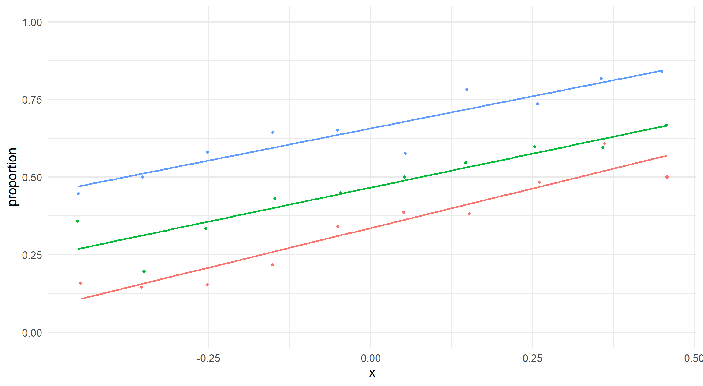
We see that even with constant slopes, the fitted line may differ emphasising the randomness of this data generation and sensitivity of the test to be introduced.
visualise_relationship(data_const_slopes)
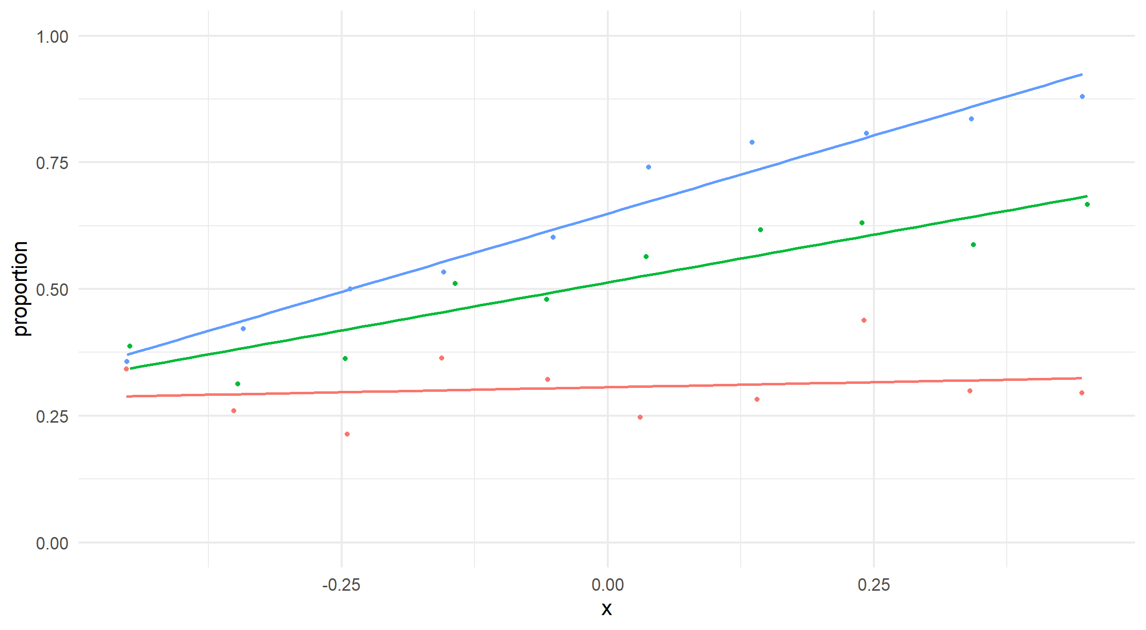
On the other hand, the varying slopes are much more like what we designed.
visualise_relationship(data_varying_slopes)
Hypothesis Testing
Our hypothesis is that there is no difference between the slopes and so the relationship between the event and x is constant when we account for the differences in each category.
For each dataset, we wish to compare the model that assumes constant slopes and a model that does not. That is, compare \[
log \left( \frac{p}{1 - p} \right)
= \beta_0
+ \beta_1 \text{Category}
+ \beta_2 x
\] and \[
log \left( \frac{p}{1 - p} \right)
= \beta_0
+ \beta_1 \text{Category}
+ \beta_2 x
+ \beta_3 \left( \text{Category} * x \right)
\] where I’m taking liberties with notation as we actually have \(k - 1\) parameters for \(k\) categories.
Interaction Term
One check would be to use \(\beta_3\) and conclude there is significant evidence to reject constant slopes hypothesis if and only if that variable is significant in output.
One advantage here being that we get a p-value for each new slope after the reference category (category A). If you have enough categories or enact enough tests, it would be expected that some p-values are significant even when the slopes are identical (Type I error).
Likelihood Ratio Test
A formal approach would be to fit the two (nested) models and assess if the introduction of \(\beta_3\) is worth the added complexity to the model. We can do this in a GLM context using a Chi-squared test.
For the example with no change in slope, we observe the p-value from the Chi-squared test (model 2 against model 1) is larger than \(0.05\) so we do not have evidence to reject the hypothesis that the slopes are identical.
anova( stats::glm(event ~ category + x, data = data_const_slopes), stats::glm(event ~ category * x, data = data_const_slopes),test ="Chisq")
Analysis of Deviance Table

Model 1: event ~ category + x
Model 2: event ~ category * x
  Resid. Df Resid. Dev Df Deviance Pr(>Chi)
1      2396     515.99
2      2394     515.61  2  0.37928   0.4146
On the contrary, the different slopes dataset results in a very significant p-value and so we have very significant evidence that the added term improved the model and the slopes are different.
anova( stats::glm(event ~ category + x, data = data_varying_slopes), stats::glm(event ~ category * x, data = data_varying_slopes),test ="Chisq")
Analysis of Deviance Table

Model 1: event ~ category + x
Model 2: event ~ category * x
  Resid. Df Resid. Dev Df Deviance  Pr(>Chi)
1      2396     530.01
2      2394     519.12  2   10.889 1.245e-11 ***
---
Signif. codes:  0 '***' 0.001 '**' 0.01 '*' 0.05 '.' 0.1 ' ' 1
Final Words
We have shown how to test a hypothesis within a frequentist approach and create a p-value, but interpreting these results with an applied dataset is difficult and should be handled with care, https://en.wikipedia.org/wiki/Misuse_of_p-values.
My initial approach to this would typically be Bayesian (see Bayesian varying slope models) so if there is anything I have missed, please let me know!