simdata_corr <- simulate_correlated_normal(offdiag = 0.9)
visualise_ts(simdata_corr)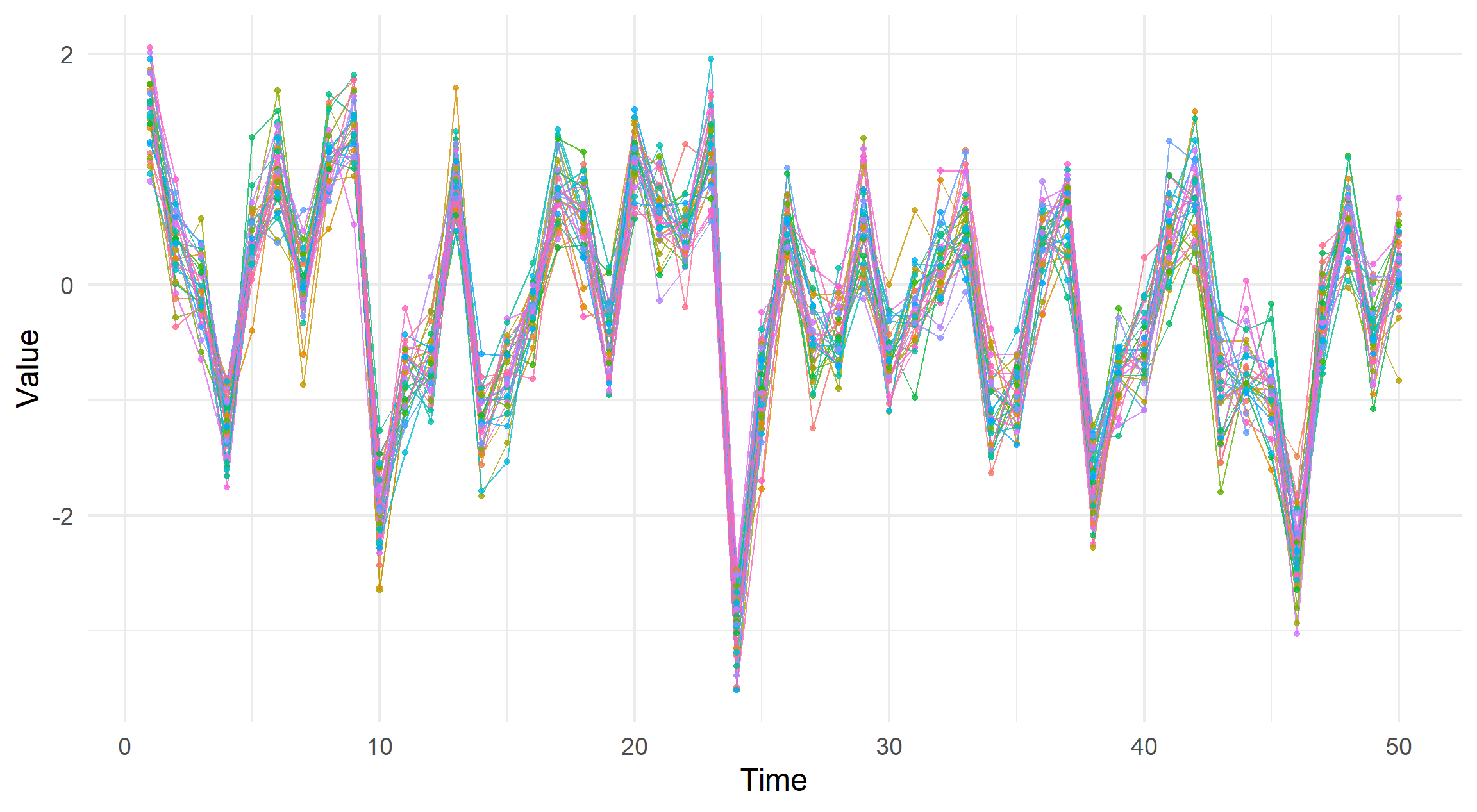
Plotting many series of data leads illegible legends and colours. We make use of the gghighlight package as a means of showing all data whilst also focusing on a single series.
See Functions for implementation.
This is part one of a two part series. Stay tuned till October 27th.
The idea behind this plot is that we can draw a line for each data generating process, which we will refer to as a collection of series. In my application this takes the form where each series is a separate well within a groundwater monitoring site.
If the lines coalesce we can qualitatively infer that each series are somewhat correlated.
Conversely, if the lines deviate from each other at random the opposite is true.
For example compare these two plots with varying correlations.
simdata_corr <- simulate_correlated_normal(offdiag = 0.9)
visualise_ts(simdata_corr)
simdata_indep <- simulate_correlated_normal(offdiag = 0.2)
visualise_ts(simdata_indep)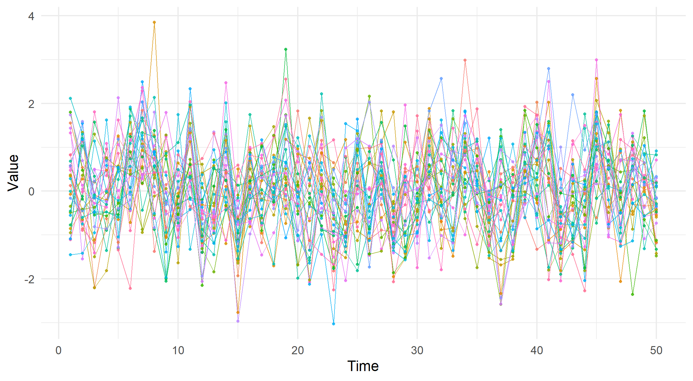
The two functions used are defined as follows.
simulate_correlated_normal.R
#' Simulate Correlated Data
#'
#' Simulates `n` by `p` multivariate normal data with
#'   suggested correlation.
#'
#' @param n integer. Number of observations.
#' @param p integer. Number of variables.
#' @param offdiag numeric, between 0 and 1. Informs correlation matrix.
simulate_correlated_normal <- function(n = 50, p = 30, offdiag = 0.95) {
  mu <- rep(0, p)
  Sigma <- diag(1 - offdiag, p) + matrix(offdiag, p, p)

  as.data.frame(MASS::mvrnorm(n, mu, Sigma))
}visualise_ts.R
#' Visualise Time-Series Data
#'
#' Plot used in blog post to show many time-series like data.
#'
#' @param x data frame. Only data columns should be given here.
#' @param highlight character vector. Names of variables to highlight.
visualise_ts <- function(x, highlight = NULL) {
  plot_data <-
    tidyr::pivot_longer(tibble::rowid_to_column(x), -.data$rowid)

  out <-
    plot_data %>%
    ggplot2::ggplot(ggplot2::aes(
      x = .data$rowid,
      y = .data$value,
      colour = .data$name
    )) +
    ggplot2::geom_line(alpha = 0.8) +
    ggplot2::geom_point(alpha = 0.8) +
    ggplot2::labs(x = "Time", y = "Value", colour = "Series") +
    ggplot2::guides(colour = "none")

  if (is.null(highlight)) return(out)

  out +
    gghighlight::gghighlight(
      .data$name %in% highlight,
      unhighlighted_params = ggplot2::aes(alpha = 0.2),
      use_group_by = FALSE
    ) +
    ggplot2::guides(colour = "legend")
}When there are many series, adding a legend would be hard to read and cause confusion between similarly coloured lines.
Adobe suggests limiting categorical colours to 6, at most and states 12 colours are
extremely difficult to understand
If we were to re-add the legend, this fact becomes clear.
visualise_ts(simulate_correlated_normal(offdiag = 0.9)) +
  ggplot2::guides(colour = "legend")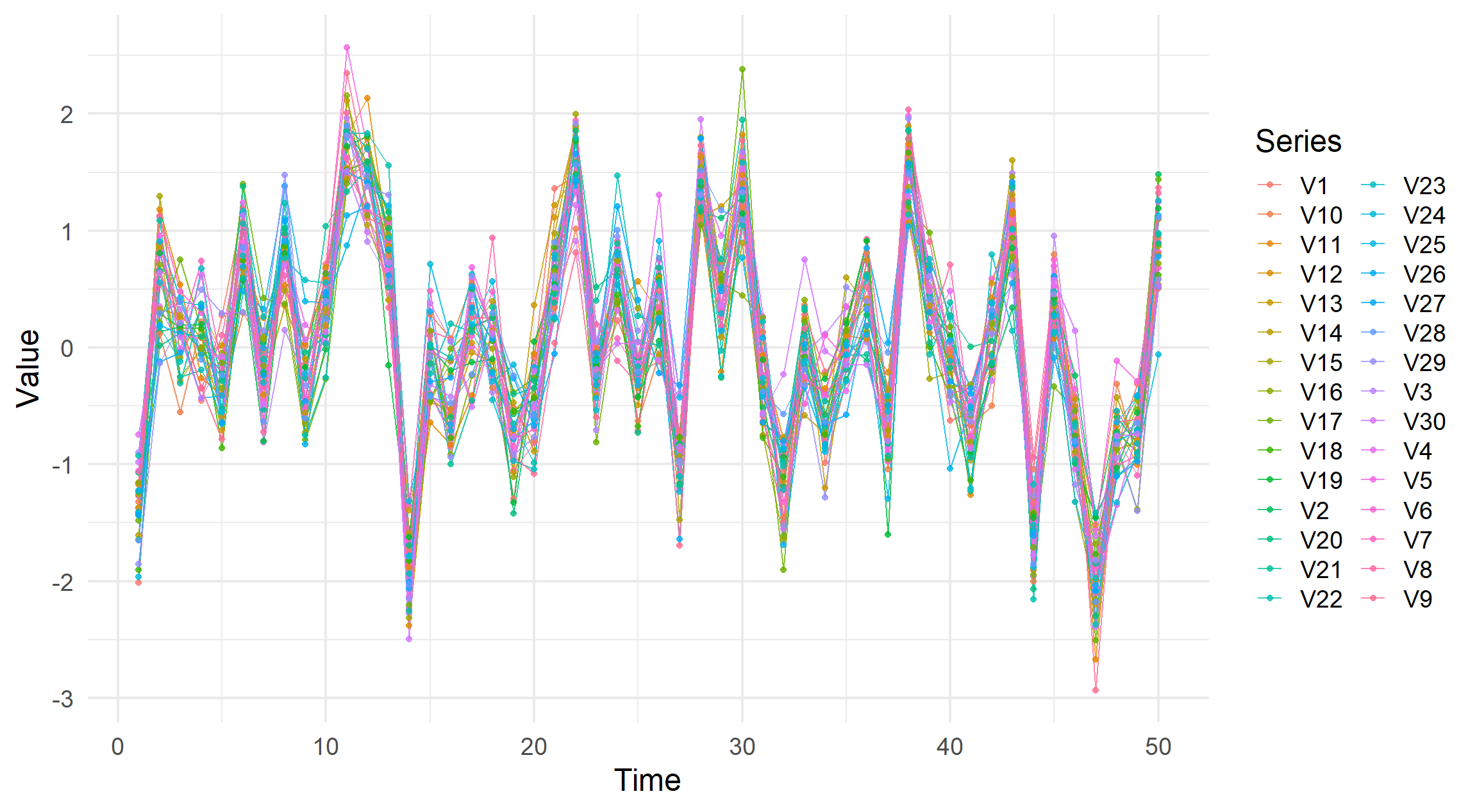
So, we can see a global picture of the data but drilling down in specific series or understanding which series have high values or deviate from population trends is near impossible.
The gghighlight package allows us to focus on a single value within an aesthetic.
Therefore, if we were super interested in the 30th variable and how it appears in these plots, we would add the function as follows using a dplyr::filter syntax.
ggplot2::ggplot(...) +
  ggplot2::geom_point(...) +
  ggplot2::geom_line(...) +
  gghighlight::gghighlight(series == "V30")
See the gghighlight documentation for more details.
In our implementation, we allow for an optional variable (or variables!) to be identified by name and then highlighted while reducing the other aesthetics opacity from 0.8 to 0.2
visualise_ts(simdata_corr, highlight = "V30")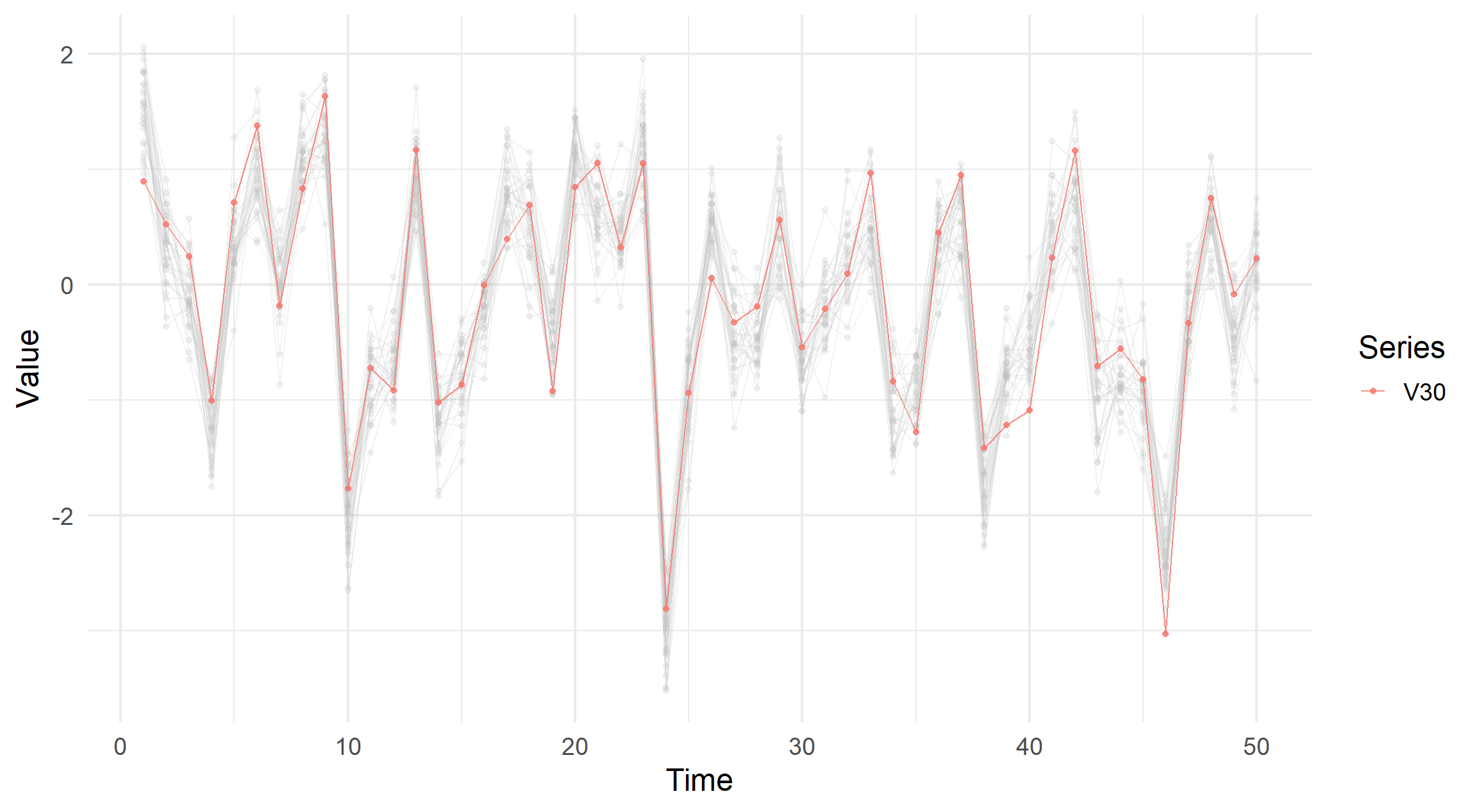
visualise_ts(simdata_indep, highlight = "V30")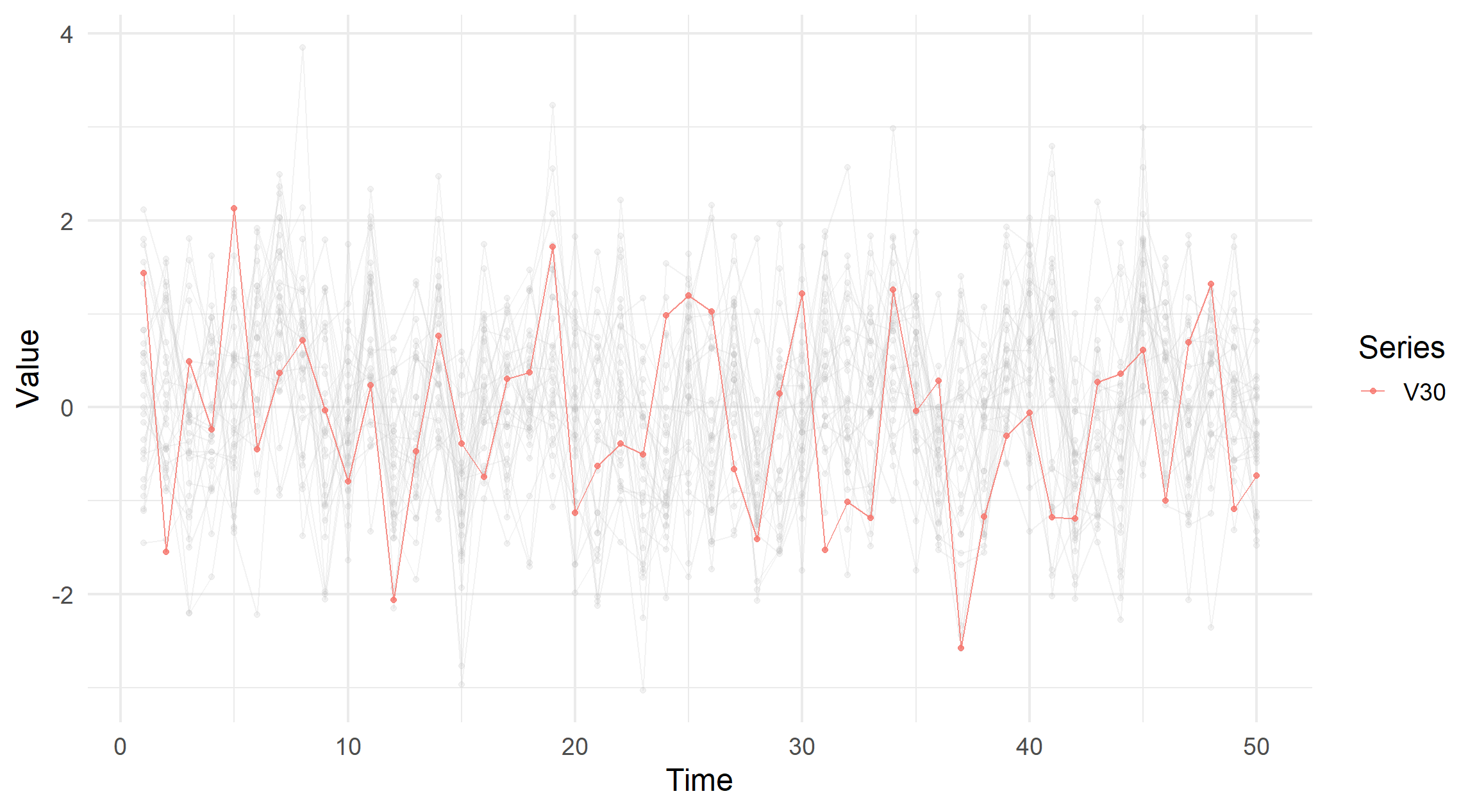
visualise_ts(simdata_indep, highlight = c("V1", "V30"))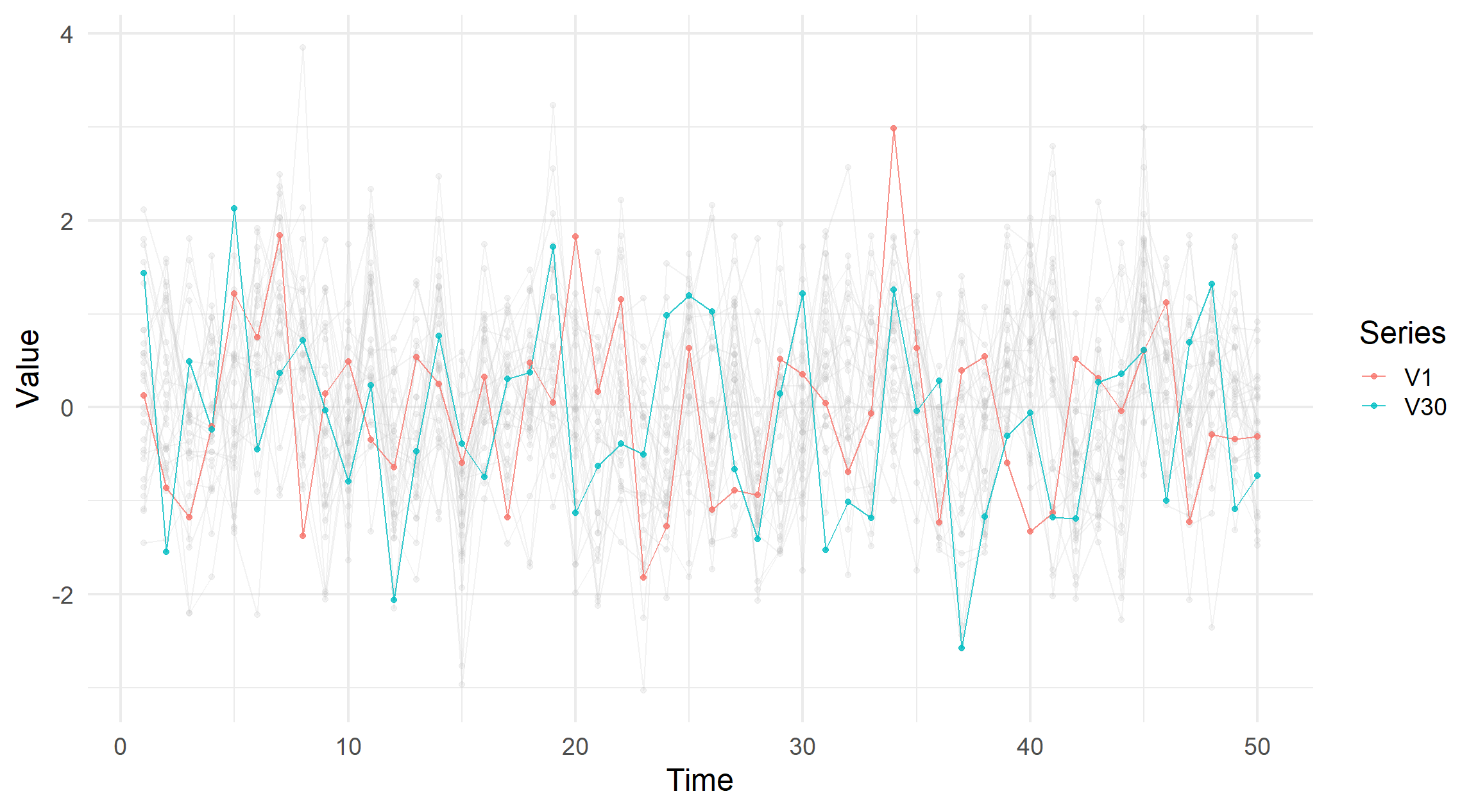
Looking as these visualisations, there is a desire to simply click on a line and highlight the series it belongs to.
Obviously, this is not possible with a static image but what if we were to use Shiny and the nearPoints function?
Josh Cowley. October 7th, 2022. “The Catalyst, Newcastle Upon Tyne”.